Deprecated: Use of "parent" in callables is deprecated in /home/292293.cloudwaysapps.com/ejxumdpjev/public_html/wp-content/plugins/divi-module-code-snippet/divi-shim/class_DBCS_Builder_Module_3_1.php on line 165
Deprecated: Use of "parent" in callables is deprecated in /home/292293.cloudwaysapps.com/ejxumdpjev/public_html/wp-content/plugins/divi-module-code-snippet/divi-shim/class_DBCS_Builder_Module_3_1.php on line 158
Make The Blog Layout Into A List
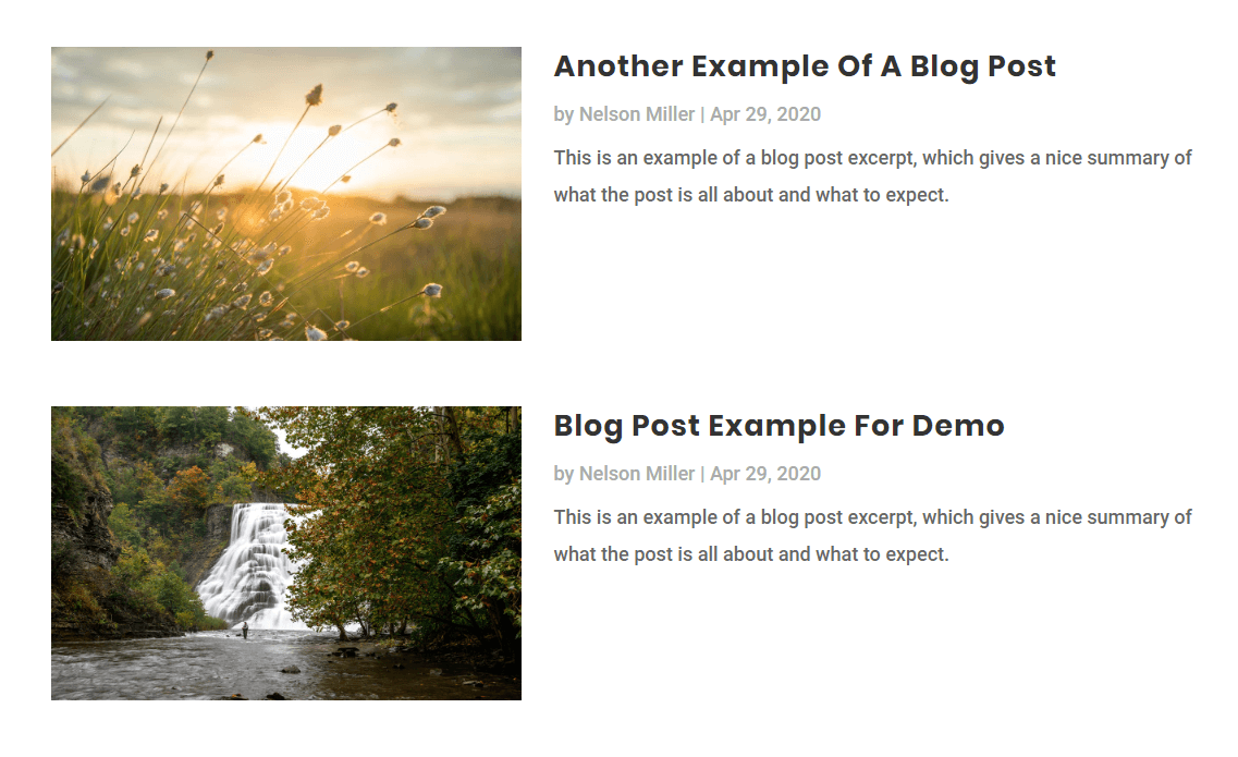
We have an exciting series on the Divi Blog module, and this will be a great addition. This is a quick CSS code snippet that changes the Divi blog module into a nice list with the image on the side and the details on the other side. I’ll show you how to have the image on the left, or on the right. I’m really excited about this, because it’s so quick and easy even for beginners!
Make The Divi Blog Module Image On The Left And Details On The Right
Step #1: Set The Blog Module To Fullwidth Layout
Go the Blog Module settings to the Design tab and set the Layout to Fullwidth. Don’t worry if this looks wrong. We need to set it this way to make the next step much easier. If we kept it as a grid layout, it would be much harder to achieve the desired layout.
Step #2: Add The CSS Class To The Blog Module
In order to only affect certain Blog modules on the site, we can use a custom class. So open up the Divi Blog module settings and go to the Advanced tab. From there, open the CSS ID & Classess toggle. Place the class “pa-blog-list” into the CSS Class input field there.
Step #3: Set The Image and Details Width With CSS
Basically, we are telling the image to be only 30% wide. Then we tell the title, meta, and excerpt to be 70% wide. By adding a float left on them, it makes them stack up beside each other. This is better than some of the other similar tutorials because it keeps all the text on the side instead of wrapping around the image.
Where To Paste The CSS Code
1. Divi Assistant
If you are using our Divi Assistant plugin, simply paste the code in the CSS tab in the custom code window in the Divi Visual Builder.
2. Child Theme
If you are using a child theme, paste this code into the style.css file. If you don't have a child theme, you can generate a child theme directly on your site or download our free child theme.
3. Divi Theme Options Integration
Otherwise, paste this code in your Divi>Theme Options>Custom CSS code box.
If you need help understanding where to paste the code, please check out our complete guide about where to add custom code In Divi.
/*add media query so changes only affect tablet and desktop*/

@media (min-width: 767px) {

/*set the image width*/

.pa-blog-list .entry-featured-image-url  {
width: 30%;
float: left;
margin-bottom: 0!important;
}

/*set the details width*/

.pa-blog-list .entry-title,
.pa-blog-list .post-meta,
.pa-blog-list .post-content {
width: 70%;
float: left;
padding-left: 30px;
}
}
There you go! You now can adjust the widths if you want, just make sure the percentages equal 100%.
Add Some Fancy Styling
While we are here, let’s add some little touches that will make a huge impact. In the follow snippet, we are going to style each one of the events by adding spacing around them, a border radius, and a box shadow.
/*style the individual posts*/

.et_pb_post {
box-shadow: 0px 2px 80px 0px rgba(160,190,212,0.22);
border-radius: 6px;
padding: 60px;
}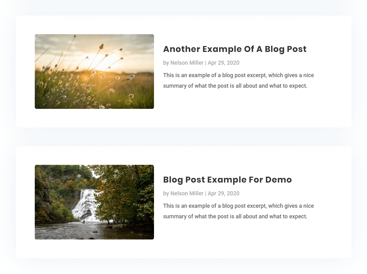
Much better, right? Feel free to play around with this, and be on the lookout for more tutorials about the Divi blog module!
Make The Images Square
You may have seen our series on cropping Divi images to a certain aspect ratio. Those were so fun, and we wanted to show you how to do that here as well. So let’s make the blog image square, even if it isn’t when you upload it.
First of all, add “padding-top: 30%” to the first snippet above. That will make the height the same as the 30% width that we designated. Note that if you changed that number to something else, you will also have to make this number match.
Add the following snippet to your code in the Divi Theme Options.
/*blog image aspect ratio square 1:1*/

.entry-featured-image-url {
  padding-top: 30%;
  display: block;
}

.entry-featured-image-url img {
  position: absolute;
  height: 100%;
  width: 100%;
  top: 0;
  left: 0;
  right: 0;
  bottom: 0;
  object-fit: cover;
}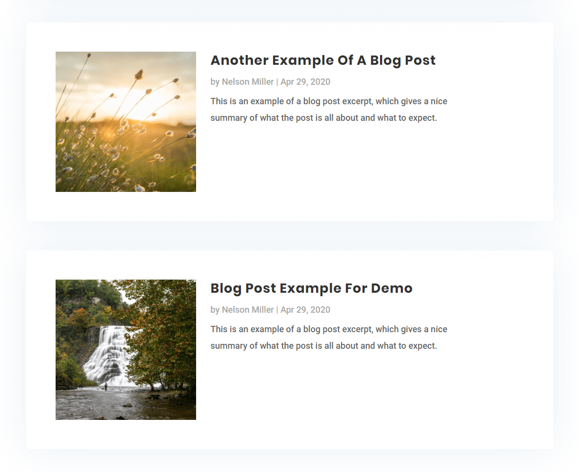
Much better, right? Feel free to play around with this, and be on the lookout for more tutorials about the Divi blog module!
Make The Divi Blog Module Image On The Right And Details On The Left
So if you want, you can use the same snippet as above and just change one thing. Instead of saying to float left, just say float right!
I’m not going to provide this snippet, because you should learn to edit CSS on your own! You can do it! :)
NEW: Vertically Align The Details
I am updating this post with a new option. Now that the image is on the left, and details on the right, it might be nice if the details were aligned vertically. This gets a bit trickly, but it’s pretty easy to do if we use jQuery. However, note that this code is totally different than what was given above, so either use this, or the code above.
CSS
.pa-blog-list article{
    display: flex;
    align-items: center;
 }

 .pa-blog-list article a{
     width: 30%
 }

  .pa-blog-list article .wrap{
     width: 70%
 }

  .pa-blog-list .entry-title,
 .pa-blog-list .post-meta,
 .pa-blog-list .post-content{
     width: 100%;
 }

 @media all and (max-width: 768px){
   .pa-blog-list article{
    flex-direction: column;
 }
  .pa-blog-list article a{
     width: 100%
 }

  .pa-blog-list article .wrap{
     width: 100%
 }
 }
jQuery
<script>
jQuery(document).ready(function(){
    jQuery(".pa-blog-module article").each(function(){
        jQuery(this).children('h2,p,div').not(':first-child').wrapAll('<div class="wrap"></div>');
  })
})
</script>




Hi Nelson
Great Tutorials !
How would you target this at a specific blog module – (I’ve a couple of different blog mods spread across my site 🙂
Got as far as understanding that I need to use a seperate CSS class but how would this show in the code – know its #cssclassname but not sure exactly where it needs to go 🙂
Thanks again 🙂
Hi Rach,
Sure, so any time I have a snippet that you want to be specific, just add a custom class to the beginning and then add that class in the module Advance tab in the CSS Class input field (don’t use the period at the beginning here, only in the snippet) For this one you will need to add your class in front ever each selector.
Ah thanks Nelson, It was the adding it before every seperate selector that threw me 🙂
Much appreciated 🙂
Thanks for this tip.
Can this be applied to the presentation of products on the shop page? By default, divi presents products in grid form, I want them to be listed. Please help.
Hey Fortespy,
We are working on this approach and you will get the solution for this shortly.
Since you don’t cover mobile in this tut how would I get the same exact layout on mobile? The images are not square? Also one more thing that could make this better is customizing the read more button on this module. Thanks I totally enjoy your tutorials.
Hi RudyGee,
I do have a tutorial on customizing the read more button, be sure to be checking our blog as this has been out many months.
To make this work on mobile, simply remove the media query!
This method is the sort of thing I’ve been looking for and the code seems to have the desired effect, but changing the main elements color changes the entire module including the spaces in between the blog posts. Is there any way to have each Blog post have a background color while still leaving the spaces in between the blank?
Hi Spence,
The .et_pb_post would work perfeclty for adding a background color to individual posts.
Hi Nelson,
Can you please make a tutorial on how to make the Divi shop module (when using woo-commerce) into list view.
Thanks
Thanks Dom, that’s a good idea!
Thank you, that was a great tutorial I’ve been looking for since a while. 🙂 Is there any chance to change the position of the images from left to right than right to left in every row within the blog module?
Hi Ada,
Yes, I mention that in the post at the bottom.
Thank you! 🙂 That makes all images left or all images right, if I get you right. 🙂
What I thought was, that on one post the image is left, than the next one right, than the next one left again and so on. 🙂 That would be something really eye catching.
I know it could be done by making separate post modules and making excerpts, but automated… you’d be my hero. 😀
Hi Nelson, thanks for the tutorial! And not only this one 😉
How can I reduce vertical distance between list items?
Hi Rogier,
Sure, you should be able to reduce (override with important) the margin bottom on each of the .et_pb_post.
If the post title is longer and takes two rows for example, what happens with the excerpt? Does the CSS code takes care about this? Because if you have a fixed word count defined in DIVI, the exerpt will just go out of this “imaginary” box shape. Please let me know.
Hi Milan,
Can you show me a link? It should just flow…
Hi Nelson. So, here is the situation: I copy pasted your CSS code in the Custom CSS section on Page Settings here https://www.howtodigitalstuff.com/guides/ (it is live now). What I am concerned is that the featured image is not aligned on the bottom with the post excerpt. What I would like to achieve is: the post title to be aligned with the top of the image, and the bottom of the image to be aligned with the last sentence of the post excerpt – so it would be visually appealing. If you go to the home page of my blog you will notice that more or less this is accomplished with only one exception: and that is when the length of the title is longer and it continues to the second row, then the alignment on the bottom is broken.
Can you advise?
Hi Nelson, really great tutorial just what I was looking for, however I notice its thrown the dynamic headings I have on some of the posts I have and created a wide border around full page. Any idea how I could override this on these pages. An example of this would be at
http://dajocreativedev.com/sva/lot-15-buchley-garage-balmuildy-road-bishopbriggs-g64-3qn/
cheers Dave
Hi Dave,
I’m not sure what you mean. I don’t see a list layout on your link, and I don’t see any issues. Let me know.
No worries Nelson, I achieved same idea with a plugin for now, but will keep the snippet for the future. Thanks again Dave
Great tutorial sir
Thank you very much!
I would admit that you save my hours of thinking and finalizing this type of layout. Thanks
Hi Ahmed, that is great to hear! Thanks for sharing!
Is there a way to target just a certain blog module with this code?
Hi Ray,
Absolutely, with anything you can always add a custom class to the module and in the snippet. Just put it before each of the items in the snippet.
Like this? For example:
.custom_class .entry-featured-image-url { width: 30%; float: left; margin-bottom: 0!important; } /*set the details width*/ .custom_class .entry-title, .post-meta, .post-content { width: 70%; float: left; padding-left: 30px; } }Almost! You would also need it before each item, notice how the comma is used in the second snippet, so you would need it for each of those three selectors.
Love your tutorials, I just added the Reorder The Divi Blog Image, Title, Meta, Excerpt, and also this tutorial to my blog.
But I have a question. When I put it in list move and I do a reorder… the list gets messed up. So I would like the image left, and on the right side : first the meta, then title, then excerpt and then button. Is that possible?
I have not tried that. What happens exactly?
It shows it like it was not reordered. I have two different meta orders in my home page.
Can you share a link? I haven’t tried combining them or looking closely at it yet.
Best R.
If you want to change the order of the items and you are using the second code snippet where jQuery and display flex is used then remove the code given below from the CSS snippet:
  .pa-blog-list article .wrap{

     width: 70%

 }
and add the code given below on its place:
  .pa-blog-list article .wrap{

     width: 70%;

     display: flex;

     flex-direction: column;

 }

 .pa-blog-list article .wrap h2{

    order: 2;

 }

  .pa-blog-list article .wrap p{

     order: 1;

 }

  .pa-blog-list article .wrap div{

     order: 3

 }
You can change the order number as per your liking. Please let us know if that helps.
Hi Nelson,
Thanks for creating that specific blog module tutorial.
I tried your method but the thing is I’m facing a problem (which shown as screenshot), some of the contents goes under the image.Can you please help me to get rid of.
Thanks 🙂
This might be happening because the image you are using there is very small. Please try adding a different image with increased height and see if that helps. 🙂
Okay sure. I know it’s happening because of image, i want to know is there any way to fix it without depending on image size?
Could you please share the URL of the page where this section is placed so that I could investigate further?
Thank you for the Tutorial!
You’re welcome Doris!
I’m looking for a way to turn the blog module results into a list with only the titles showing. Which in turn could be used to show only a specific number of posts and from specific categories or tags. In other words, no images, no excerpts and no meta data. I have looked everywhere but the title lines seem impossible to style properly. So, a simple list (like the most recent widget lists) please?
If you want to show a simple list with the blog titles, then first of all go to the Blog Module Settings > Elements and disable all the content that you don’t need. As we already have placed the pa-blog-list custom class in the blog module so we will use that for the CSS snippet. Please go to the Divi > Theme Options > Custom CSS Panel and place the CSS snippet given below:
/*This snippet is for removing the margin between the titles*/

.pa-blog-list article{

    margin: 0 !important;

}

/*This snippet is for the bullet points*/

.pa-blog-list article .entry-title:before{

    content: ".";

    position: relative;

    top: -3px;

    left: -4px;

    font-size: 40px;

}

/*This snippet is for hiding the post content div*/

.pa-blog-list article .post-content{

    display: none;

}
Let us know if that helps. 🙂
Hi Nelson,
A great post which solved my initial problem. One question, how to I “isolate” the CSS to only one page, e.g. my home page?
For this purpose, please paste your CSS inside the page settings. First, go to the Home Page and enable the Visual Builder. After that click on the bottom center three dots icon and then click on the settings icon. This will open the Page Settings. Go to the Advanced Tab > Custom CSS and place your code there.
Let us know if that helps. 🙂
Hi javascript download work when we paginate the blog module
It works on intiall page load but when we paginate then it looks javacript isnt wrapping the elements in wrap class div
Hi Hamza
Thank you for addressing the issue and you are right that the code is working on the initial page load only. Please try using the code which is given below and see if that helps.
Code: https://www.codepile.net/pile/bPApy4mn
We will update the code in the guide as soon as possible. 🙂
Let us know how it goes.
Hi Nelson, great tutorial just what I needed.
Is it possible to have 2 posts next to each other in a list?
Hi Jody
Could you please try using the code given below and see if that helps?
Code: https://www.codepile.net/pile/VerqQVGX
Let us know how it goes. 🙂
is it possible to have a portrait image is a blog listing?
Please check my other tutorials. https://wordpress-292293-1617718.cloudwaysapps.com/how-to-stop-divi-image-crop/
I’m having trouble getting this to work with a post format set to video. Any thoughts there?
Hey Brian,
I am afraid that I am not able to replicate any issue on my end on your website. If you still facing the issue, please share the exact URL of the page and we will be happy to help. 🙂
This works perfectly on featured images, but when I use Video Post format, the videos appear huge and above the title text. Is there something I can add to the code to make the video do the same as the featured image?
Thank you!
Not sure, can you share a link?
Thanks for this great tutorial! I adjusted the size of my featured image (80%), but how do I adjust the size of the hover overlay color block to match the size of the featured image?
If you hover over the featured image you’ll see what I mean:
https://bluelight.wordpressplay.com/resources/
Hi Chanel,
Please use this snippet and let me know how it goes.
.pa-blog-list .entry-featured-image-url .et_overlay {
width: 80%;
height: 80%;
}
Thank you so much. This took about 30 seconds and worked perfectly. 🙂
That’s awesome Patty, so glad it was nice and easy for you!
It doesn’t vertically align, unfortunately. I have also tried using other CSS codes but they don’t vertically align. I have tried with top and bottom margin which works but meta texts go inside the excerpts.
I have tried your javascript but it doesn’t seem to do anything.
Hi Shovon,
Could you please share the URL of the website for me to investigate further?
Hi Nelson!
I entered the Divi world only a few months ago. Your tutorials have become a frequent help because you very often explain the obvious needs that many of us have.
As most of my Divi projects are non-commercial I even more appreciate that you share so much of your knowledge for free. This is heart-warming for someone without a budget for his projects. Is there a way to buy you a coffee?
Thanks a lot, Nelson.
Frank
Hi Frank,
I’m very glad to hear this, it makes me happy to know the free resources are helping! I support my family with the income from products and membership, but I also have the tip feature on each blog post if you feel like doing that. But otherwise you can enjoy the content and pay it forward!
This is perfect thanks! How can I add a 1px divider line between the blog posts??
Hi Sian,
You could do that with something like this:
.pa-blog-list .et_pb_post {
border-bottom: 1px solid red;
}
And maybe add padding and margin as needed.
Hi Nelson
Thanks for your useful tutorials.
I’ve been attempting to create exactly this layout for a particular category of a CPT. As the Divi blog module doesn’t support category filtering of CPT in the blog module I’m using Divi Blog Extras. Tried adapting this CSS to their module without success.
Do you have any suggestions?
I do have a suggestion, wait for my freebie on Tuesday January 25! 🙂
why those code doesn’t work on my site using divi?
The code should work fine, be sure to follow all instructions carefully.
Hi Nelson,
Great tutorial. This worked great. On mobile though the image is no longer square but rectangle. How can I change that image on mobile to remain square like it is on desktop and tablet?
Hey Adam,
Could you please share the URL of the page in order for me to investigate the query?
Thank you for sharing this!
I’m probably doing something wrong, but when I add the code (either the initial CSS or the CSS + Jquery) the image and text still appear stacked. The image floats left but the text doesn’t move to the right side. I’m not sure if there is some code in my site somewhere else that would cause this not to work? Any thoughts? See the post below the full width slider: https://theplacewithgrace.com/
Yeah I see you have some display: flex; added that is conflicting.
Brilliant! You’re amazing. So, now each element is in its own column (image, meta, title, excerpt). Have I copied something wrong?
Hey Molly,
Could you please share the URL of the exact page where you are facing this issue?
Sure thing: https://theplacewithgrace.com/
You can see the component right below the hero has separated into 4 columns when I applied the “vertical align” CSS & jQuery.
It looks like a mix of all the CSS and no jQuery, so I am not sure why I see CSS and no jQuery, but do not use both CSS for vertical align AND the previous, only use the code for vertical align.
Hmm, I did remove the first set of CSS and replaced with the vertical align CSS. Also put the jquery in the Integration > section. That’s okay, I’ll figure it out. Probably something small I’m overlooking. Thanks for taking the time to review!!
Hi Nelson.
Great tutorials.
How do I force all images to be the same height regardless of the actual featured image size?
Thanks.
Hi Rene, this is already covered in the tutorial. 🙂
Great tutorial. How do we get the meta text to align with the title text using the first CSS option? It is currently wrapping underneath the featured image.
I have tried the jquery option but it does not work on our site due to some conflicts with other CSS I believe.
Hey Gabe,
Could you please share the URL of the page for me to investigate it further?
I’ve posted a comment a few times but it keeps getting deleted for some reason. I am trying to figure out to keep the meta text from wrapping up under the featured image when the title extends beyond the height of the image. I’m using the CSS in the tutorial which works great other than the issue with meta text not aligning with the title in some cases. I have tried adding CSS to align but nothing I’ve done has worked so far. I’ve read through all the comments and did not see any solutions posted that would help. This is for one of my larger clients and any help is greatly appreciated.
This is the site with the CSS and module.
https://wp.charismamag.com/
Hey Gabe,
The URL that you have provided is not working, could you please provide the valid URL in order for me to investigate this issue?
Hi! I think my question disappeared because I do not see it above …
Thanks for a great tutorial!
There are some posts i have that do not have a images(no thumnail) and then there will be unnecessary space to the right and left. I would like the text to fill out on both sides, how do I do that?
Hey Odette,
I have checked the URL provided but I am not able to spot the issue that you have mentioned in your comment, could you please guide me to where I can find that post without thumbnail so I can fix that for you.
How can I apply these style to woocommerce product. been looking for a solution on how to show my products on list view in mobile. if you can help me on any way plis !
It would be a similar process, but since this tutorial is not about that we cannot just write the instructions here. In the future we will have a tutorial on this.
Just what I was needing! thank you! Question–I have two different section that I am wanting to use the blog list format for. The first section uses the widths that you provided in the coding. But for the second section, I’m wanting the text to be much closer to the featured image (so I’d like less padding and space between the two). Is there a way to make this possible without messing up the widths of the first section? Thank you in advance!
Absolutely, you can always do that with any snippet by using a different CSS class. Make the class different for the one, like pa-blog-list-2 and then change that in the second snippet and update your code in that snippet.
Ah, why didn’t I think of that, haha. Thank you! It worked! One more question though, so this only applies to desktop and tablet, I see. What would I change in order for this code to only apply to phone and not affect desktop and/or tablet?
Hey Alexan,
Please place the whole code inside this media query code:
@media all and (max-width: 768px){
//place the code here
}
Hi! Alexan here, again. I tried combining the blog list layout and the square ratio image and I’m having a bit of trouble. It seems to be working fine on desktop, but on mobile, the images are cropped oddly but not in the shape of a square. More of a rectangle. I’m not sure what I’m doing wrong here. I’m only using this combination for one section in my blog so maybe I messed up in the coding. I also added a code specifically for mobile only and one for devices larger than mobile. This is what I’ve applied:
/*add media query so changes only affect tablet and desktop*/
@media (min-width: 767px) {
/*set the image width*/
.pa-blog-list-3 .entry-featured-image-url {
width: 30%;
float: left;
margin-bottom: 0!important;
}
/*set the details width*/
.pa-blog-list-3 .entry-title,
.pa-blog-list-3 .post-meta,
.pa-blog-list-3 .post-content {
width: 70%;
float: left;
padding-left: 30px;
}
}
/*blog image aspect ratio square 1:1*/
.pa-blog-list-3 .entry-featured-image-url {
padding-top: 30%;
display: block;
}
.pa-blog-list-3 .entry-featured-image-url img {
position: absolute;
height: 100%;
width: 100%;
top: 0;
left: 0;
right: 0;
bottom: 0;
object-fit: cover;
}
/*** Responsive Styles Smartphone Only ***/
@media all and (max-width: 767px) {
/*set the image width*/
.pa-blog-list-3 .entry-featured-image-url {
width: 40%;
float: left;
margin-bottom: 0!important;
}
/*set the details width*/
.pa-blog-list-3 .entry-title,
.pa-blog-list-3 .post-meta,
.pa-blog-list-3 .post-content {
width: 60%;
float: left;
padding-left: 10px;
}
}
Any help is appreciated! I can also include my URL if needed.
Hey Alexan,
Could you please share the URL of the website for me to investigate it further?
Hi again! I’ve asked this question a couple of times but it keeps disappearing for some reason. I tried combining the blog list and square ratio codes and it works well on desktop but it isn’t working on mobile. I thought I added an effective additional code with the proper media query for mobile, but the images aren’t responding correctly. They are cropped oddly in a rectangle shape. Not sure what I’m doing wrong, so any help is appreciated!
Here’s the coding I’ve applied:
/*add media query so changes only affect tablet and desktop*/
@media (min-width: 767px) {
/*set the image width*/
.pa-blog-list-3 .entry-featured-image-url {
width: 30%;
float: left;
margin-bottom: 0!important;
}
/*set the details width*/
.pa-blog-list-3 .entry-title,
.pa-blog-list-3 .post-meta,
.pa-blog-list-3 .post-content {
width: 70%;
float: left;
padding-left: 30px;
}
}
/*blog image aspect ratio square 1:1*/
.pa-blog-list-3 .entry-featured-image-url {
padding-top: 30%;
display: block;
}
.pa-blog-list-3 .entry-featured-image-url img {
position: absolute;
height: 100%;
width: 100%;
top: 0;
left: 0;
right: 0;
bottom: 0;
object-fit: cover;
}
/*** Responsive Styles Smartphone Only ***/
@media all and (max-width: 767px) {
/*set the image width*/
.pa-blog-list-3 .entry-featured-image-url {
width: 40%;
float: left;
margin-bottom: 0!important;
}
/*set the details width*/
.pa-blog-list-3 .entry-title,
.pa-blog-list-3 .post-meta,
.pa-blog-list-3 .post-content {
width: 60%;
float: left;
padding-left: 10px;
}
}
Hey Alexan,
Could you please share the URL of the page for me to investigate it further?
I am looking to do something like this with the portfolio module.
Is this possible?
Yes for sure anything is possible, probably a very similar approach, just change the CSS selectors.
hi there,
Thanks for your great tutorial. I found this article from youtube.
I have question. My blog is a custom design which contains many modules inside.
How to apply this css to the Blog module only, not the whole page?
I need your help. I really appreciate it.
Thanks
This tutorial already applies to the blog module, so I am not sure what you mean by the question.
I just copied the CSS code you provided
(/*add media query so changes only affect tablet and desktop*/
@media (min-width: 767px) {
/*set the image width*/
.pa-blog-list .entry-featured-image-url {
width: 30%;
float: left;
margin-bottom: 0!important;
}
/*set the details width*/
.pa-blog-list .entry-title,
.pa-blog-list .post-meta,
.pa-blog-list .post-content {
width: 70%;
float: left;
padding-left: 30px;
}
}
But it comes Expected RBRACE. in second row and Unexpected token ‘}’. in last two row.
I don’t know how to fix it .
That means you are placing it in the wrong location, take note of where to add CSS and it will work good.
Hello Nelson – love watching your videos they are very insightful!
I am having an issue with the css not working properly, i tried both the first CSS and also the new version with jquery. not able to get either to work.
Any insights on what i am doing wrong would be great. thanks, R.
Hi Rob!
Could you please share the URL of the page for me to investigate it further?
Hi dude
Thank you for the information about Divi, css, jquery and etc.
Your so incredible, Keep sharing dude
Thank you so much
You’re welcome, so glad you like our resources!
This is not working for me……..can you tell me what I did wrong?
https://dndesignaz.com/articles/
Hi Diana!
I have checked the page and the posts are displaying in the list format. If it isn’t showing in list format at your end, then try clearing the cache and check again.
I love this layout! Been using it in many places.
For my current design project, I want to center the image for phone (<768px). I know how to use the media query, but how do I get it centered? I've tried targeting both of these (separately), setting margin-right and -left to auto, but no luck…
.pa-blog-list .entry-featured-image-url
.pa-blog-list .entry-featured-image-url img
Example:
https://thankful4thescars.com/category/process/
Hi Terri!
Hi Terri!
Please try using the following CSS and see if it helps:
@media all and (max-width:767px){
.et_pb_post .entry-featured-image-url{
display: flex;
justify-content: center;
align-items: center; }
}
Hi! I’ve been trying to get this code to work for my blog-lists classified as “pa-blog-list-1” but things just seem to keep going wrong, I’m not sure what I’m doing. I’m wanting the images to be cropped into squares and the code is being paired with the blog list code for mobile.
I’ll share my URL so you can see what I’m talking about.
The issue is with the blog list modules in “the latest” section. Any help is appreciated! :’)
I checked and can see that you have not added the code to make the images square, so just add that.
Never mind! I think I figured out where I went wrong. Thanks Nelson!
Thanks for sharing this, it’s amazing. I have one issue on mobile view where there is no spacing between the image and the blog title. I know it’s probably going to be a simple bit of CSS, but I can’t figure it out, can you point me in the right direction please.
I’m not quite sure what you mean, can you share a link?
Hi! Thank you for such a nice css snippet.
As written in the beginning of the snippet, it applies to PC and tablets, but is there a way to apply it to mobile as well?
@media (min-width: 767px) {
I deleted this part of the code and tested it, and it shows on mobile, but only the title is visible and meta and content are not visible.
Please give me a good method.
Thank you.
Hi Ricky!
Can you please share the URL of the page to investigate further?
I will layout a Divi Blog Module with a list layout and tried your Live-Hack:
https://wordpress-292293-1617718.cloudwaysapps.com/how-to-change-the-divi-blog-module-into-a-list-layout/
I followed and implemented your instructions as described on the website. But it won’t display in a list layout.
I can remember, that I´ve did it for 1-2 years with your CSS Code and has worked well. I don´t know what’s now the different is.
Maybe my Setup?
I work on a MAC Studio
Sonoma 14.2.1
Safari Browser, latest Version
(I have a Add Blocker and Antivirus Safari Plugin activated…)
Maybe there is an easy way to check this?!
Hope you have some tipp and send greets, from Germany
Hi Ralph!
Can you share the URL of the page to investigate further?
Hi Nelson, yet again you have provided great solutions for what I need. My goal is to make a simple list of post titles only, as links, in alpha order. I successfully used your alphabetical order tutorial for my blog module. I came to this tutorial to see about formatting my list because there is a lot of vertical space between posts. I can’t show you the page, but here’s what it looks like:
Post Title 1
Post Title 2
Post Title 3
What I’m trying to do is this:
Post Title 1
Post Title 2
Post Title 3
I’m sure it’s simple but I am having trouble figuring it out, and I didn’t see anything in this tutorial that might help. Sorry if this is off topic for the post, but I’m hoping you can help. Thanks!
Hi Brian, I see your other comment, but I wanted to share this other post with you in case it is helpful: https://wordpress-292293-1617718.cloudwaysapps.com/how-to-design-a-compact-list-of-divi-blog-posts/
Hi again! You can ignore my previous comment, I figured it out. For the record, it was:
.et_pb_post {
margin-bottom: 2px;
}
Thanks again for the great tutorials!
Yes great, glad you got it!