Deprecated: Use of "parent" in callables is deprecated in /home/292293.cloudwaysapps.com/ejxumdpjev/public_html/wp-content/plugins/divi-module-code-snippet/divi-shim/class_DBCS_Builder_Module_3_1.php on line 165
Deprecated: Use of "parent" in callables is deprecated in /home/292293.cloudwaysapps.com/ejxumdpjev/public_html/wp-content/plugins/divi-module-code-snippet/divi-shim/class_DBCS_Builder_Module_3_1.php on line 158
Use CSS Clamp In Divi
CSS Clamp can be used for many things, such as element widths, padding, margin, and much more. But the most common and most practical use case is for making fluid responsive typography. Our Divi Responsive Helper plugin already provides the only option to set sitewide global text for all modules, but you can take it even further by using CSS clamp within our settings. That’s right, you can use CSS clamp right now with the current Divi responsive helper options – no special settings required! In this tutorial I will give you an overview of what CSS clamp is and how to use it in Divi to make responsive fluid typography.
▶️ Please watch the video above to get all the exciting details! 👆
What Is CSS Clamp?
This is not a course on CSS clamp, it’s a tutorial of how to use it in Divi with our plugin. You can check out tons of other general CSS related resources to learn CSS clamp in-depth, but I’ll give you just the basics of what you need to know if you are new to this. You can also check out some articles on the Elegant Themes blog like this one about making modules responsive. The limitation is that you would need to do it for every module, unlike our plugin which does it once across the entire site. They also have this article about other fluid text options, #6 being about clamp.
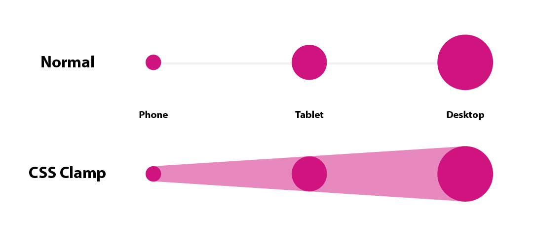
CSS clamp allows us to linearly scale text between a set of minimum and maximum sizes as the viewport’s width increases and decreases. The goal is to make the size of an element (or in this case, text size) more predictable. CSS clamp is able to set responsive unit sizes without any media queries. The function uses 3 parameters in a single line, which form a perfect solution for fluid typography. The clamp() function has everything, a starting point to set the minimum font size, a middle area to set the fluid font size, and an ending point to set the maximum font size.

text-size: clamp(minimum, preferred, maximum);Minimum – this fixed value is the minimum threshold for the element and cannot go lower than this. Keep this value in mind as the smallest font size you want for Phone sizes.
Preferred – this dynamic relative value is what will be outputted unless this value falls below the minimum or above the maximum.
Maximum – this pixel value is the maximum threshold for the element and cannot go higher than this. Keep this value in mind as the largest font size you want for Desktop sizes.
Can CSS Clamp Be Used In The Divi Builder?
No, not with the Divi Builder settings, the input fields will not accept it. The only way you could is by writing the CSS in the Advanced tab of every module, which is quite ridiculous. The one article from the Elegant Themes blog talks about this some. But I have to ask, why make it difficult? At that point, I wouldn’t even bother.
How To Use CSS Clamp In Divi With The Divi Responsive Helper Plugin
Now for the good news. It’s very easy and afters the entire site instantly with our Divi Responsive Helper plugin!
Simply choose the clamp parameters you want to use and write or paste them into the font size fields in our plugin settings. Go to Divi>Themes Options>Divi Responsive Helper>Typography.

You can see in that screenshot that I am using rem units, and that is because it works great in our specific situation, since we have three input fields. If you use pixel values, that works too, but because our plugin settings have an input for each device, it means you need to be more creative with the units like this:
But this is very easy to adjust. And of course you can set the font size for all the headings H1-H6 and for paragraph text, and it only takes a few seconds and it will affect all text on the entire site. Check the video to see how perfectly smooth the text scales from small to big as the viewport changes! Pretty cool?


Hi Nelson. Great post I was looking for a long time. Thanks for that
I managed the settings in the Responsive pliugin for all H1-6 font sizes and it worked very well. Also with the help of this tutorial: https://www.fluid-type-scale.com/ 😉
However, the paragraph font-size is not fluid. How do I set these in the plugin??
Thanks for your help and keep up the good work.
regards, Ron
Hi Ron,
That’s great to hear! For the paragraph text you can use the same method, it is also located in the Typography tab of the plugin.
I know where it is located but paragraph text sizes for not change.
They is no overwriting with non standard sizes. I am confused..
You will need to remove any other preset/customization to the font size, that’s how our settings work. the feature works, just need to make sure it has priority so if you have any adjustment in the modules, it is designed that way on purpose to override ours.
as I said, I have no customizations. still no succes with paragraph.
Sure, and as I said, something is overriding it. You can send us a message if you want us to login and locate it.
Do you have a toturial for copy to clipboard? same as what you are using in the tutorial on the top?
That is actually part of the code snippet plugin, not custom to me, sorry. But a tutorial to copy text to clipboard would be cool.
i will be waiting for this also
Hi Nelson, Thanks for this tutorial. I’ve been grappling with Clamp and using it in combination with Calc for quite a while now, looking for that magic bullet solution. The problem I’ve always found is trying to determine a way to calculate the ‘preferred’ value without trial and error.
I’d like to have it so that at the max viewport width e.g. 1920px it is the max value in Clamp. Then is scales down linearly to the tablet break point at 980px. What I’m finding though is that unless the preferred value is correct it will reach the max or min values before the upper and lower breakpoints.
I currently use a Calc equation in the preferred value that works perfectly but it is very time consuming putting it in all the modules for the three different Divi screen sizes as you pointed out in your video.
So I guess in summary, how do ‘you’ determine the preferred value?
Thanks
Hi Neil,
Well, I don’t have one, sorry. I’m no way an expert at clamp by any stretch, this was just to show how it’s possible with our plugin.
Thanks for this! It was happenstance that I was looking into clamp the same day you posted this!
My question is, do you need to set clamp for each of the three displays? I thought that if you set the max to what your desktop would be, and your min to what you phone would be, would it not fill in the rest and you would not need the other two?
Thanks so much! Love your tutorials.
We cover this question in the tutorial. Due to the settings of our plugin for each device, you need to add the clam in each one too.
thanks nelson for the tutorial, I need to ask you something, with this plugin if you want an h1 to have different sizes on a desktop computer screen, for example 1024/1366/1920, it would only be enough for me to use the “H1 Heading Text Size” field – Desktop” the following values: clamp(15px, 20px, 30px)?
Sure, if I understand correctly you only want to affect desktop, so yes you would only add it to he Desktop fields for H1 and not Tablet and Phone fields.
Thanks so much for the Divi responsive plugin. Saved me a LOT of time and a headaches.
You’re welcome Laurie, so glad you are enjoying the features!