Styling The Divi Mobile Menu Module
Another One For The Menu Module Series
By now our Divi Menu Module series is quite hug. By popular demand, we are now going to show you how to customize and style the Divi mobile menu using the Theme Builder Menu module! We are so excited for this one!
Learn, Not Just Copy
The format will be like our submenu and mega menu tutorials, with graphics and snippets to not only copy but to practice learning as well! With this tutorial, you will be able to style and customize the Divi Theme Builder mobile menu module, along with the image, hamburger menu, dropdown, menu items, and submenu items. You will learn how to change things like the colors, border, spacing, hover effects, and more!
▶️ Please watch the video above to get all the exciting details! 👆
Understanding The Divi Mobile Menu Structure
First, we need to understand how the Divi mobile menu is made so we can target individual elements of it separately to create your own design style. There are a lot of parts, but we are only going to cover the most essential and helpful parts here. Those include:
- The Header
- Logo Image
- Hamburger Icon
- The Dropdown Menu
- Menu Items & Links
- Submenu Items & Links
Here is an example of how the Divi Menu module looks by default on mobile:
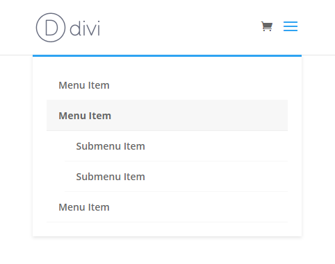
Here is an example of how the Divi Menu module looks by default on mobile:
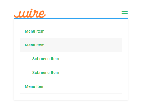
Let’s get started! The tutoral is divided into sections. Each section represents a different part of the mobil menu:
- A heading title
- An intro parapraph
- A graphic representation of that specific element
- The CSS selector to target that element
- Some code styling ideas
Where To Place And Customize The Code Snippets
You will find a snippet for each part of the menu in each section of the tutorial. Once you have our CSS selector ready, you can start adding custom code where it says “YOUR CSS HERE.” (be sure to remove that text)
Where To Paste The CSS Code
1. Divi Assistant
If you are using our Divi Assistant plugin, simply paste the code in the CSS tab in the custom code window in the Divi Visual Builder.
2. Child Theme
If you are using a child theme, paste this code into the style.css file. If you don't have a child theme, you can generate a child theme directly on your site or download our free child theme.
3. Divi Theme Options Integration
Otherwise, paste this code in your Divi>Theme Options>Custom CSS code box.
If you need help understanding where to paste the code, please check out our complete guide about where to add custom code In Divi.
Default Mobile Menu header
Let’s start with the menu header. This is the part that holds the logo and hamburger menu. There are limited settings in Divi, so this CSS is going to be needed any time you want to change the color or adjust spacing.
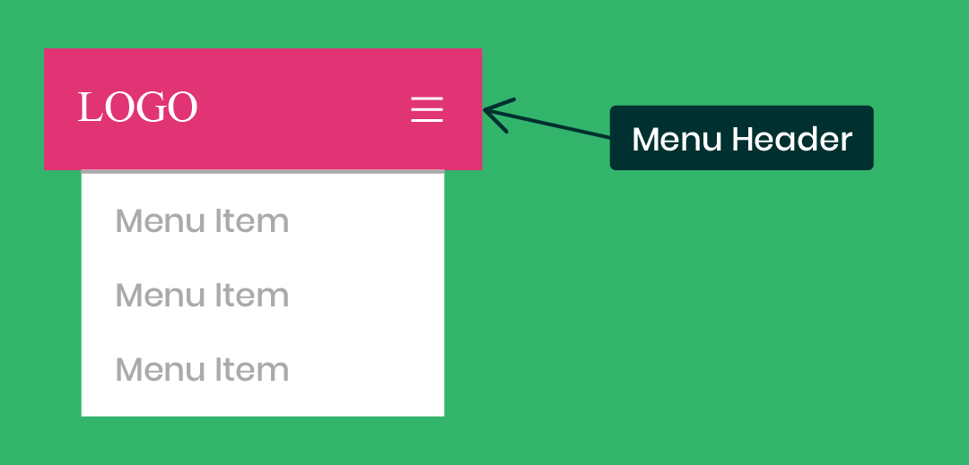
Edit The Default Menu Header
/*edit the default Divi mobile menu header*/
#main-header {
YOUR CSS HERE
}
Custom Style Ideas
The following is a list of some ideas for things you might want to do to style the overall submenu. You can choose to do this by placing the snippets into the selector shown above.
Remove Or Adjust The Spacing
padding: 0!important;Change The Background Color
background: #000000!important;Divi Mobile Menu Logo Image
You can do a couple things to the logo image as well. On our site, we have the logo overlapping the header and page content, which requires some spacing and sizing adjustments. You could also apply a border or box shadow.
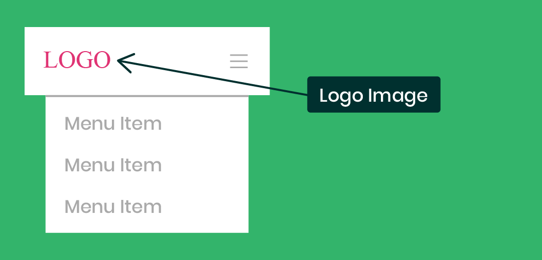
Edit The Divi Default Mobile Menu Logo Image
/*edit the Divi default mobile menu logo image*/
#logo {
YOUR CSS HERE
}
Edit The Divi Mobile Menu Module Logo Image
/*edit the Divi mobile menu logo image*/
.et_pb_menu__logo img {
YOUR CSS HERE
}
Custom Style Ideas
Here are some ideas you could do to style the Divi mobile logo image. You can choose to do this by placing the snippets into the selector shown above.
Adjust The Spacing
padding: 30px;Adjust The Width
width: 80%;Set A Max Width
max-width: 200px;Add A Box Shadow
box-shadow: 0 2px 5px rgba(0, 0, 0, 0.1);Divi Mobile Menu Hamburger Icon
If you want to change some settings with the mobile menu hamburger icon, you can do so with CSS. Remember, the Menu module has a few settings like size and color, but the default menu has no settings for this.
Edit The Divi Mobile Menu Hamburger Icon
/*edit the Divi mobile hamburger icon*/
.mobile_menu_bar:before {
YOUR CSS HERE
}
Custom Style Ideas
The following is a list of some ideas for things you might want to do to style the Divi menu hamburger icon. You can choose to do this by placing the snippets into the selector shown above.
Set The Color
color: #000000;Add A Background Color
background: #ff0000;Set The Size
font-size: 48px;Change The Icon
content: "\63";Add A Border
border: 2px solid #ff0000;Make The Border Rounded
border-radius: 100px;Change The Icon To An X When Opened
Check out this fun quick snippet: How To Change The Divi Hamburger Menu To An X When Opened
Divi Mobile Menu Dropdown
One of the first things you may want to adjust is the ugly blue thick like at the top of the mobile menu dropdown. Or maybe you want to remove some spacing around the outside, make it wider, change the background color, or adjust the shadow.
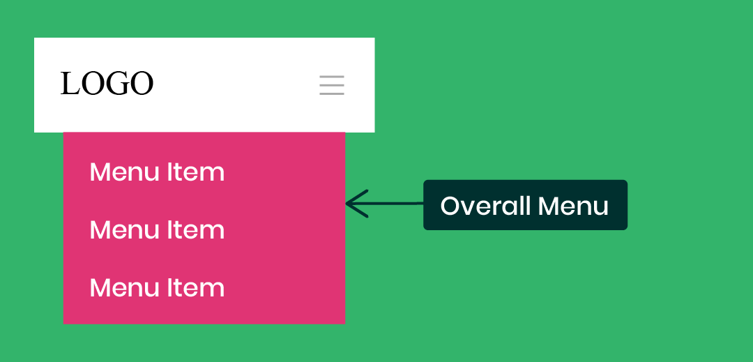
Edit The Divi Mobile Menu Dropdown
/*edit the Divi mobile menu dropdown*/
.et_mobile_menu {
YOUR CSS HERE
}
Custom Style Ideas
The following is a list of ideas of some things you might want to do to the Divi mobile menu dropdown. You can choose to do this by placing the snippets into the correct selector shown above.
Remove The Top Border
border-top: 0px;Adjust The Spacing
padding: 0px!important;Add Or Adjust The Shadow
box-shadow: 0 2px 5px rgba(0, 0, 0, 0.1);Make It Wider
width: 112%;
margin-left: -6%;
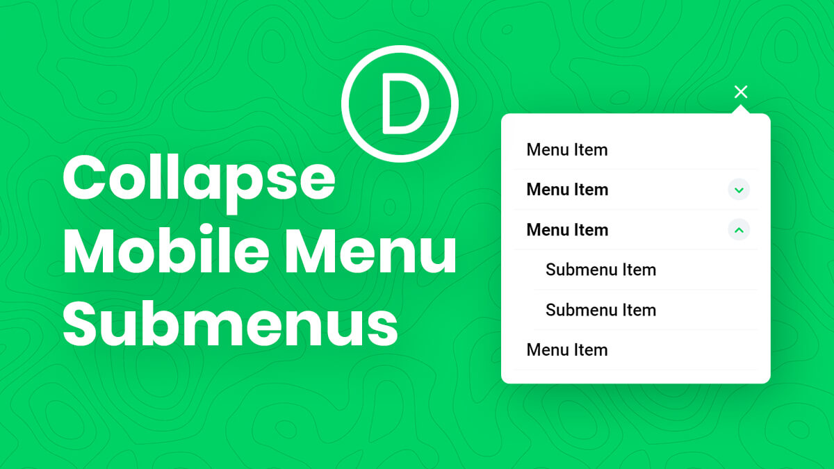
Collapse The Divi Mobile Menu Submenus
Check out this related tutorial: How To Collapse Divi Mobile Menu Submenus
Divi Mobile Menu Parent Links
Now we come to the menu item links. You can do a lot of adjustments here, like color, spacing, background, opacity, and even get rid of the tiny bottom border.
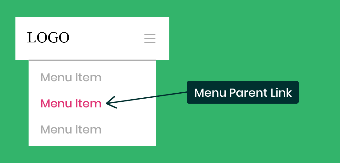
Edit The Mobile Menu Parent Links
/*Divi mobile menu parent links*/
.et_mobile_menu li a {
YOUR CSS HERE
}
Custom Style Ideas
The following is a list of ideas of some things you might want to do to style the Divi mobile menu parent links. You can choose to do this by default, or on hover, by placing the snippets into the correct selector shown above.
Adjust The Spacing
padding: 10px 20px;Change The Opacity (Especially On Hover)
opacity: 1;Change The Background Color (Especially On Hover)
background: #ffffff;Change The Font Size
font-size: 20px!important;Change The Link Color
color: #2cba6c;Add Letter Spacing
letter-spacing: 2px;Adjust The Border
border-bottom: 2px solid #000000!important;Divi Mobile Menu Submenu Child Links
Similar to the previous section, you can also adjust the submenu items. These appear by default with a small indent on the left. The styling suggestions here shoud probably be similar to the previous section about the parent links.
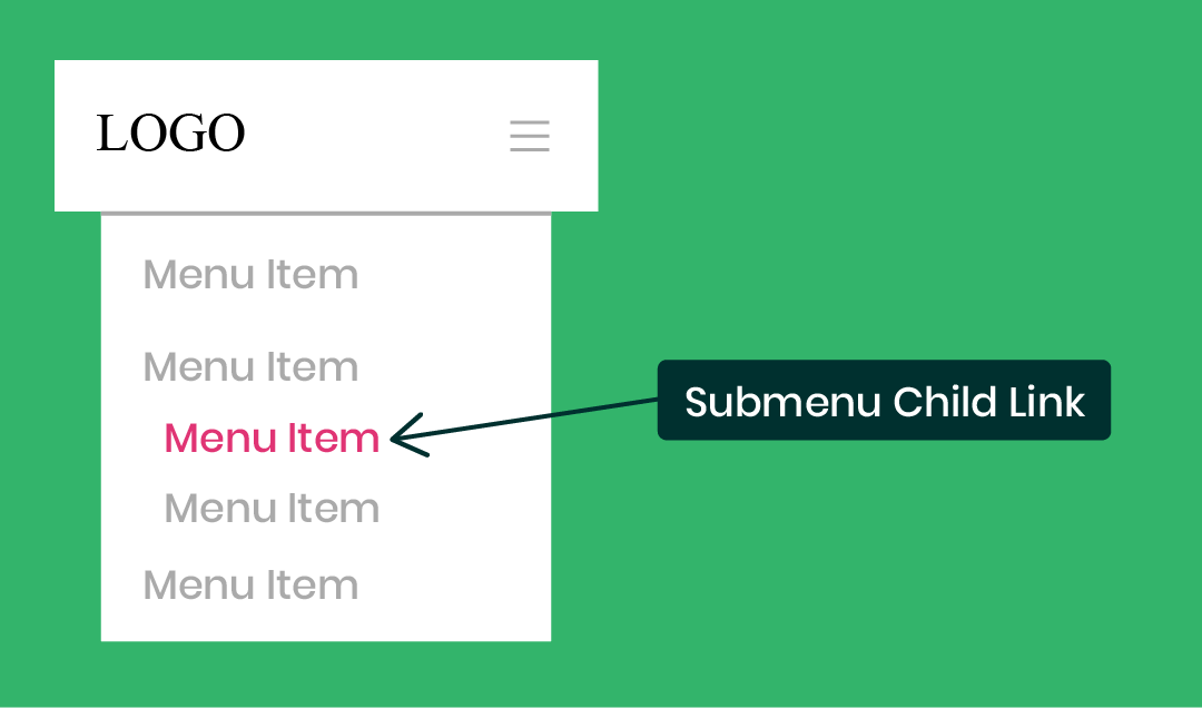
Edit The Mobile Menu Child Links
/*Divi mobile menu submenu links*/
.et_mobile_menu .menu-item-has-children li a {
YOUR CSS HERE
}
Custom Style Ideas
The following is a list of ideas of some things you might want to do to style the Divi mobile menu submenu links. You can choose to do this by default, or on hover, by placing the snippets into the correct selector shown above.
Adjust The Spacing
padding: 10px 20px;Change The Opacity (Especially On Hover)
opacity: 1;Change The Background Color (Especially On Hover)
background: #ffffff;Change The Font Size
font-size: 20px!important;Change The Link Color
color: #2cba6c;Add Letter Spacing
letter-spacing: 2px;Adjust The Border
border-bottom: 2px solid #000000!important;Prefer To Use A Plugin?
If this is all a little too much code for you, I get it. You might want to check out a plugin my friend Peter at Divi Engine made called Divi Mobile.
The Divi Mobile plugin allows you to create custom looking, beautiful mobile menus for your Divi site without having to write any code.





Your tutorials are great – do you have anything around being able to click anywhere outside the menu to close it? We have been asked to use the mobile menu on desktop too, but to have the option to click any where on the page and not just the cross to close the menu.